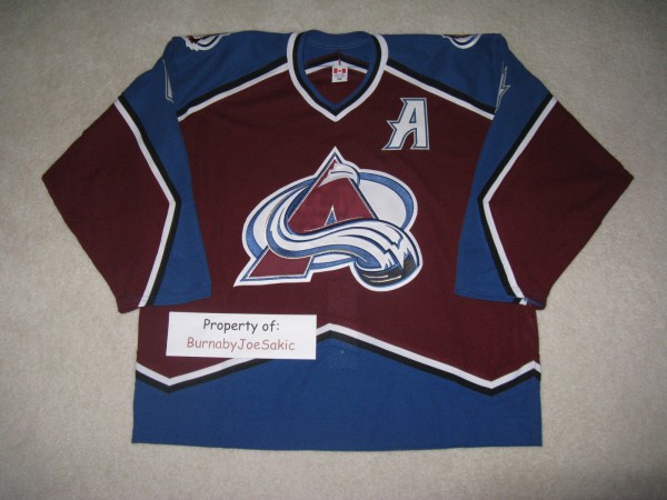
Too often, and usually on eBay, I run into jerseys that are just plain terrible. There are no other words to describe them. At times the jersey itself is fine, but the lettering/stitching/nameplate/etc. just aren’t right. I don’t give those types of jerseys a second look for the most part. They may eventually be posted on The AHP Facebook wall so the people that follow me there can absolutely hammer enjoy them, but that’s usually about it. It’s not often that I am intrigued by an Avalanche jersey that’s customized incorrectly, but that’s exactly what happened when I saw an eBay auction offering this.
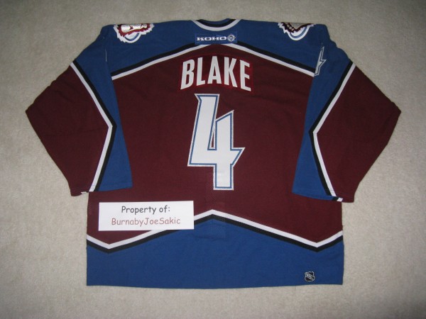
The front looked pretty good. No huge problems there. The back of the jersey is a completely different story.
There is absolutely no doubt as to the authenticity of this jersey. This is THE jersey that Rob Blake wore during the NHL All-Star Super Skills Competition the night of Saturday, February 1, 2003 at the Office Depot Center, in Sunrise, Florida. There is tagging and paperwork to prove that this is true, but that paperwork and tagging are pretty much the only things that would lead me to believe that this was worn on the ice by Rob Blake.
One would assume that this jersey, since it was worn by an Avalanche player on the ice, would be accurately customized like an Avalanche jersey from that era. That assumption would actually be very wrong.
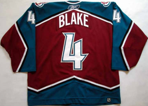
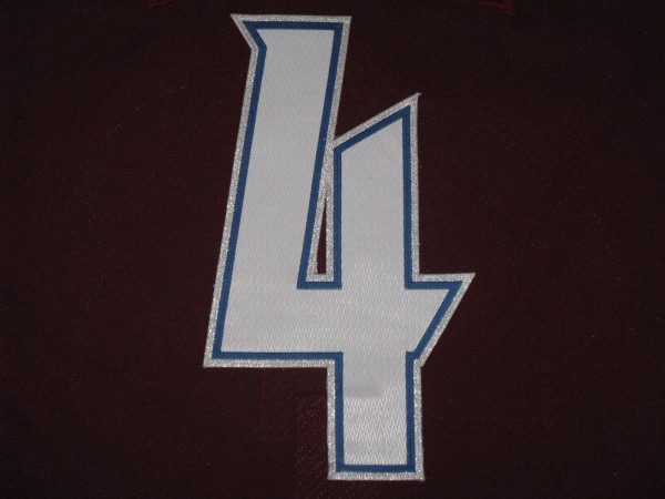
Let’s begin with the number font. It’s wrong. Here are a few Blake jerseys that we can compare the jersey above to.
The first is a game worn Rob Blake burgundy jersey from the 2005-2006 season. Different branding, but it’s the same jersey. Stay focused on the number. (This photo compliments of a past auction on gamewornauctions.net.)
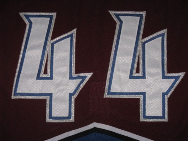
Here’s a couple of fours from a Bates Battaglia game issued jersey, from my personal collection, from the 2002-2003 season.
Now compare the fours in the previous two pictures to the four on the competition worn jersey. Without splitting hairs and breaking out a measuring tape, it’s easy to eyeball things and see that the font is definitely different.
The manner in which the numbers are cut are different as well. The Avalanche, prior to the 2005-2006 season, wore numbers that were “stacked.” The numbers, from the top and going down towards the jersey, were a white layer of glacier twill (with the criss-cross design on it), on a blue layer of twill, on a layer on silver material that sparkled. My Blake jersey’s numbers are cut in what is known as “kiss-cut.” It’s a thin, maybe quarter inch of blue, on white glacier twill, on silver. This is a trick used by customizing companies to save fabric while taking a little weight off the jersey at the same time.
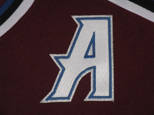
The alternate captain’s “A” on the Blake is also off. The font is close, but not perfect. The cut, like the numbers, is wrong for that era of Avalanche jersey. It’s kiss cut when it should be stacked. The “A” on the competition worn Blake is a little too large as well. I’d say it’s a quarter to a half inch too big. Here’s the “A” from the Blake.
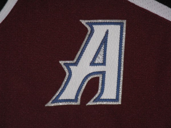
And here’s an “A” from a game issued Steve Konowalchuk, from my personal collection, from the 2006-2007 season.
Many curves on the Konowalchuk “A” while there are way more straight lines on the Blake’s “A”.
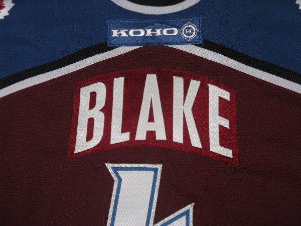
Last, but definitely not least, is the nameplate on the back of the jersey. I’ve never seen close to anything like it on an Avalanche sweater. From the picture in the auction I could have sworn that it was twill (the same material that the blue layer on the burgundy jersey numbers is made of), but upon receiving the jersey I was totally surprised to see that the nameplate was actually made of Starter mesh material. It should be the material that the rest of the jersey is made of, a material called Air Knit. In other words, it should match.
Here’s an example of a Starter mesh nameplate on a Starter mesh jersey from my collection.
Looks good. Looks like they belong together and, ya know, matches n’ stuff. Now check out the Blake, burgundy Starter mesh on Air Knit.
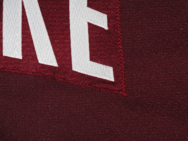
Not only is the font on the letters (compare to the pics above) off by a long shot, the material doesn’t match. Here’s a closer look.
Yikes.
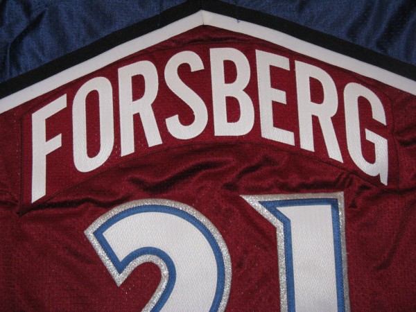
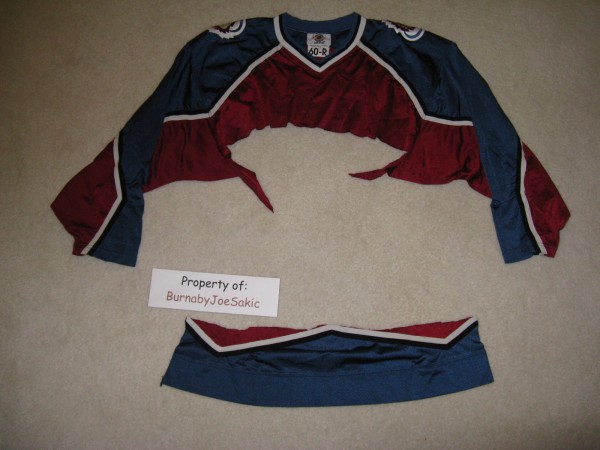
Like I mentioned early in this post, I’ve seen twill nameplates on jerseys when they shouldn’t be there, but I’ve never seen mesh on Air Knit. The Starter mesh has actually gotten so rare that collectors, including myself, have had Denver Athletic, or their favorite customizer, take the crest off an older Starter jersey and then cut up the rest for nameplates for other mesh jerseys. The end result looks a little something like this.
It’s a practice affectionately known as “cannibalizing.” Not to worry though, most everyone takes a jersey, like the one above, that was in bad enough shape that it wasn’t worth getting customized anyways and re-purposes/sacrifices it for a greater cause. It’s new lease on life! How do you think that Forsberg Pro Player jersey (pictured above) got such a fantastic nameplate?
Bottom line, it would take someone who knows absolutely anything about Avalanche jerseys and/or has an eye for small details approximately a fraction of a second to figure out the this Blake jersey failed to come within 500 miles of Denver Athletic’s warehouse here in The Mile High City. In this case though, it’s the details that make the Blake wrong that actually makes it very right. This jersey really doesn’t fit in with all of the other Avalanche jerseys in my collection, either game worn, issued, or customized authentic jerseys that have visited Denver Athletic at one time or another, and that’s definitely okay by me. That fact just adds to the story behind the jersey that I love to share with the people that read my posts.
